Bonfire is a large project I am currently working on in my spare time. It is a site I am creating for Boy Scout troops to easily administer their troops. In this devlog, I’ll show you how to make an events card list using Vue and Vuetify.
Event List in Bonfire
In Bonfire, I make use of an list of event cards to display upcoming or past events to the user. The user can filter between important, upcoming, and past events. Above the filter is a search bar that can filter the list using a clientside fuzzy search algorithm. This is mainly intended for the user to be able to filter out and search for reoccuring events such as meetings.
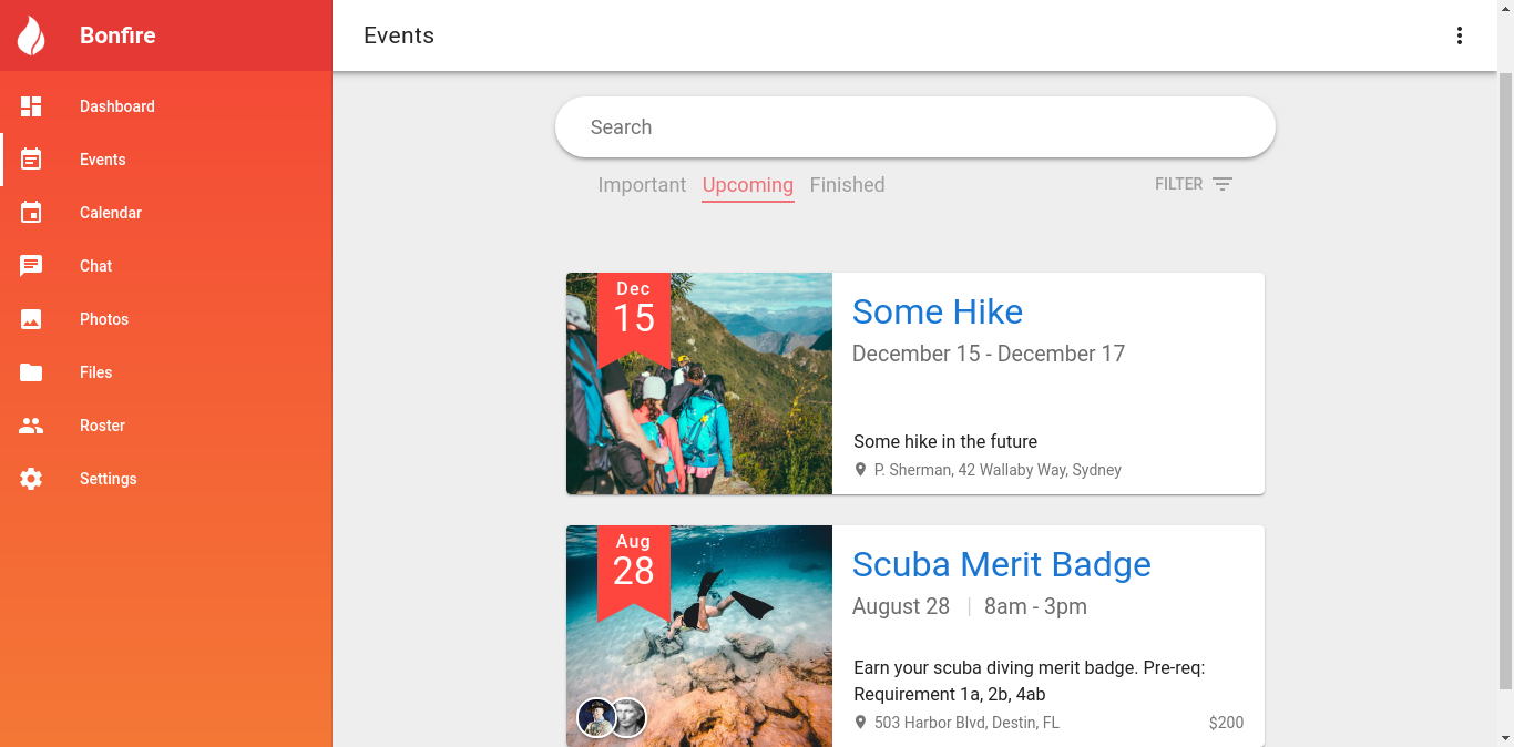
Let’s learn how to create this using Vue and Vuetify!
What we’ll be making
Here’s a demo of what we’ll be making.
Differences
There will be a few differences to what I’ll be helping you make to simplify the tutorial. First off, Bonfire retrieves the list via a REST request. I’ll load the data into an array for obvious reasons. Second, Bonfire handles dates differently. The REST request will pass a UTC Timestamp start_date and end_date and the client side does some magic to handle what to show. It’s not difficult but noncore. I’ll just pass in a string with a string to show. I’ll omit the fuzzy search filtering because it’s long and isn’t hard to implement yourself.
Let’s get started
I recommend you open up an account on codepen.io and follow along. You can find the code at my codepen.
If you need any help during the guide, hit me up on twitter and feel free to ask me anything!
Let’s start by importing our necessary libraries. We’ll need vue.js, vuetify.js, velocity.js, the roboto font, and vuetify.css.
If you’re using Codepen open up the pen settings and simply input the necessary libraries.
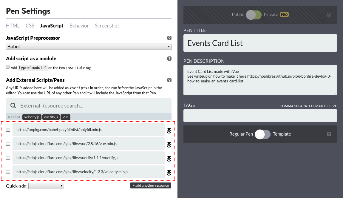
Otherise, just copy-paste the following links into the header and below the body:
1
2
3
4
5
6
7
8
<!-- In <head> -->
<link rel="stylesheet prefetch" href="https://fonts.googleapis.com/css?family=Roboto:300,400,500,700|Material+Icons">
<link rel="stylesheet prefetch" href="https://cdnjs.cloudflare.com/ajax/libs/vuetify/1.1.1/vuetify.css">

<!-- End of <body> -->
<script src="https://cdnjs.cloudflare.com/ajax/libs/vue/2.5.16/vue.min.js"></script>
<script src="https://cdnjs.cloudflare.com/ajax/libs/vuetify/1.1.1/vuetify.js"></script>
<script src="https://cdnjs.cloudflare.com/ajax/libs/velocity/1.2.3/velocity.min.js"></script>
Now that everything is imported let’s start writing some code!
Let’s take advantage of Vuetify’s layout elements. In your HTML, add the following:
1
2
3
4
5
6
7
<v-content style="background: #eee">
  <v-container>
    <v-layout justify-cetner>
        <!-- The rest of the HTML will go here -->
    </v-layout>
  </v-container>
</v-content>
This automatically handles all the fancy centering and padding in our application. No need to worry about flex boxes and whatnot.
Now let’s switch to the JavaScript. Let’s set up our Vue object. I’m assuming you have basic knowledge of Vue. If not, I recommend learning from vue’s own site and then Sarah Drasner’s great guide.
1
2
3
4
5
6
7
8
9
10
11
12
13
14
15
16
17
18
19
20
21
22
23
24
25
26
27
28
29
30
31
32
33
34
35
36
37
new Vue({
  el: '#app',
  data: () => ({
    searchIsFocused: false,
    eventsUpcomingFilter: 'important',

    filter: {
      upcoming: true,
      important: true,
      search: ''
    }
  }),
  methods: {
    searchFocus() {
      this.searchIsFocused = true;
    },
    searchUnfocus() {
      this.searchIsFocused = false;
    },
    upcomingFilterChange() {
      switch(this.eventsUpcomingFilter) {
        case 'important':
          this.filter.upcoming = true;
          this.filter.important = true;
          break;
        case 'upcoming':
          this.filter.upcoming = true;
          this.filter.important = false;
          break;
        case 'finished':
          this.filter.upcoming = false;
          this.filter.important = false;
          break;
      }
    }
  }
});
What we’ve just done is declared a Vue object with a bunch of variables and methods. The searchIsFocused variable and searchFocus functions set the shadow on the search input. The eventsUpcomingFilter reflects the radio selection. The filter object simplies holds the values passed on to the event list. upcomingFilterChange sets the filter values based on the radio input. Now back to the html.
Inside the <v-layout> insert the following:
1
2
3
4
5
6
7
8
9
10
11
12
13
14
15
16
17
18
19
20
21
22
23
24
25
26
27
28
29
<v-content style="background: #eee">
  <v-container>
    <v-layout justify-cetner>
      <!-- Insert the following -->
      <v-layout class="wrapme" column align-center justify-center>
        <div :class="['search-bar', searchIsFocused ? 'elevation-6' : 'elevation-3']">
          <input placeholder="Search"
                 v-on:focus="searchFocus()"
                 v-on:blur="searchUnfocus()"
                 type="text"
                 name="search"
                 v-model="filter.search">
        </div>
        <v-layout align-center justify-space-between row style="width: 100%;">
          <div class="upcoming-events-filter-group">
              <input type="radio" id="importantSelect" name="important-select" value="important" v-model="eventsUpcomingFilter" @change="upcomingFilterChange()">
              <label for="importantSelect">Important</label>
              <input type="radio" id="upcomingSelect" name="upcoming-select" value="upcoming" v-model="eventsUpcomingFilter" @change="upcomingFilterChange()">
              <label for="upcomingSelect">Upcoming</label>
              <input type="radio" id="finishedSelect" name="finished-select" value="finished" v-model="eventsUpcomingFilter" @change="upcomingFilterChange()">
              <label for="finishedSelect">Finished</label>
              <div class="underline"></div>
          </div>
        <v-layout>
        <!-- End of what you just inserted -->
      </v-layout>
    </v-layout>
  </v-container>
</v-content>
Alright a lot just happened. What did we just do? We created a v-layout holding the search bar. The div binds the elevation-6 class (the box-shadow) if searchIsFocused. We then create an input, bind it to filter.search, and set the focus listeners. Afterwards, we create another v-layout. This will hold the Upcoming/Important/Finished selectors. In it we create the radio group.
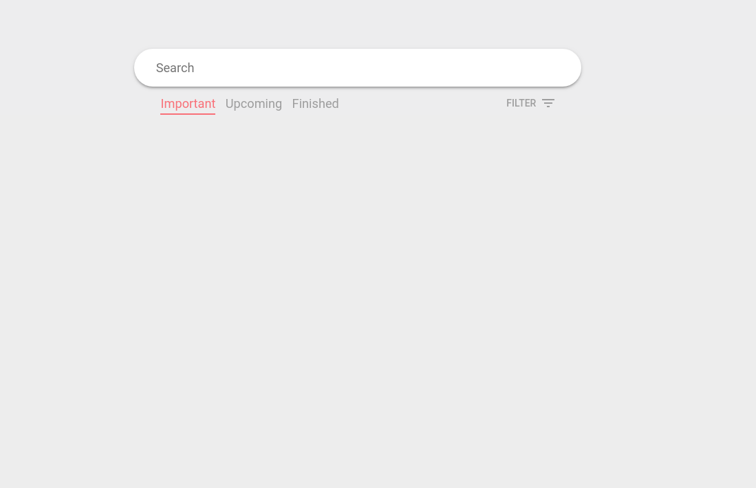
You should see some elements appear on the page but it looks quite broken. Let’s add some styling to it shall we?
1
2
3
4
5
6
7
8
9
10
11
12
13
14
15
16
17
18
19
20
21
22
23
24
25
26
27
28
29
30
31
32
33
34
35
36
37
38
39
40
41
42
43
44
45
46
47
48
49
50
51
52
53
54
55
56
57
58
59
60
61
62
63
64
65
66
67
68
69
70
71
72
73
74
75
76
77
78
79
80
81
82
83
84
85
.wrapme {
  width: 70%;
  max-width: 650px;
}

.search-bar {
  margin-top: 5em;
  background: #fff;
  padding: 1em;
  width: 100%;
  border-radius: 10em;

  transition: box-shadow 300ms ease;
}

.search-bar input {
	width: 100%;
  border-style: none;

  color: inherit;
  background-color: transparent;

  padding-left: 1em;
  font-size: 1.3em;
}

.search-bar input:focus {
  outline: none;
}

.upcoming-events-filter-group {
  padding: 0 2.4em;

  position: relative;
  display: inline-block;
}

.upcoming-events-filter-group input{
  visibility: hidden;
  opacity: 0;
  position: absolute;
  top: -999;
  left: -999;
}

.upcoming-events-filter-group label {
  cursor: pointer;
  font-size: 1.3em;
  margin: 0 0.3em;

  color: #9E9E9E;

  transition: color 300ms ease;
}

.upcoming-events-filter-group input:checked + label {
  color: #F07077;
}

.upcoming-events-filter-group .underline {
  position: absolute;
  bottom: -3px;
  left: 2.73em;

  height: 2px;
  width: 6em;
  background: #F07077;

  transition: 300ms ease;
}

.upcoming-events-filter-group #importantSelect:checked ~ .underline {
  left: 2.73em;
  width: 5.7em;
}

.upcoming-events-filter-group #upcomingSelect:checked ~ .underline {
  left: 9.45em;
  width: 6em;
}

.upcoming-events-filter-group #finishedSelect:checked ~ .underline {
  left: calc(100% - 2.7em - 5em);
  width: 5em;
}
Bam. It should now look something like this:
Now to make the list. Add the following to the top of your JavaScript, above new Vue():
1
2
3
4
5
6
7
8
9
10
11
12
Vue.component('event-list', {
  props: ['filterUpcoming', 'filterImportant', 'filterSearch'],
  data: () => ({
    eventList: []
 }),
 computed: {
   filteredList() {
     return this.eventList;
   }
 },
 template: `<h1>Hi world</h1>`
})
We just created our event-list component. The props will be used to pass the filters from the parent to this component. In computed we have a method called filteredList which currently returns the eventList. We’ll work on this later. template is where we’ll put the HTML for the component. Make sure that you use the “`” tick marks rather than the conventional single quotes. This is a new string feature in ES 6 allowing us to make multi-line strings. This will make it much easier to code the component.
Next we’ll add our new component to the page.
Insert the following after the <v-layout> containing the radios.
1
2
3
4
5
<event-list
  :filter-upcoming="filter.upcoming"
  :filter-important="filter.important"
  :filter-search="filter.search"
/>
Your HTML should look like the following:
1
2
3
4
5
6
7
8
9
10
11
12
13
14
15
16
17
18
19
20
21
22
23
24
25
26
27
28
29
30
31
32
33
34
<v-content style="background: #eee">
  <v-container>
    <v-layout justify-cetner>
      <v-layout class="wrapme" column align-center justify-center>
        <div :class="['search-bar', searchIsFocused ? 'elevation-6' : 'elevation-3']">
          <input placeholder="Search"
                 v-on:focus="searchFocus()"
                 v-on:blur="searchUnfocus()"
                 type="text"
                 name="search"
                 v-model="filter.search">
        </div>
        <v-layout align-center justify-space-between row style="width: 100%;">
          <div class="upcoming-events-filter-group">
              <input type="radio" id="importantSelect" name="important-select" value="important" v-model="eventsUpcomingFilter" @change="upcomingFilterChange()">
              <label for="importantSelect">Important</label>
              <input type="radio" id="upcomingSelect" name="upcoming-select" value="upcoming" v-model="eventsUpcomingFilter" @change="upcomingFilterChange()">
              <label for="upcomingSelect">Upcoming</label>
              <input type="radio" id="finishedSelect" name="finished-select" value="finished" v-model="eventsUpcomingFilter" @change="upcomingFilterChange()">
              <label for="finishedSelect">Finished</label>
              <div class="underline"></div>
          </div>
        <v-layout>
        <!-- Your fancy custom component -->
        <event-list
          :filter-upcoming="filter.upcoming"
          :filter-important="filter.important"
          :filter-search="filter.search"
        />
        <!-- End of what you just inserted -->
      </v-layout>
    </v-layout>
  </v-container>
</v-content>
See the :filter-upcoming and the following lines? Those are the props we passed into the component. This allows our component to take data from outside. In this case, we are setting filterUpcoming from our component to filter.upcoming (The object we declared in new Vue()). filterUpcoming turns into filter-upcoming because HTML is case insensitive so Vue converts the props to kebab case.
Here’s what it should look like so far
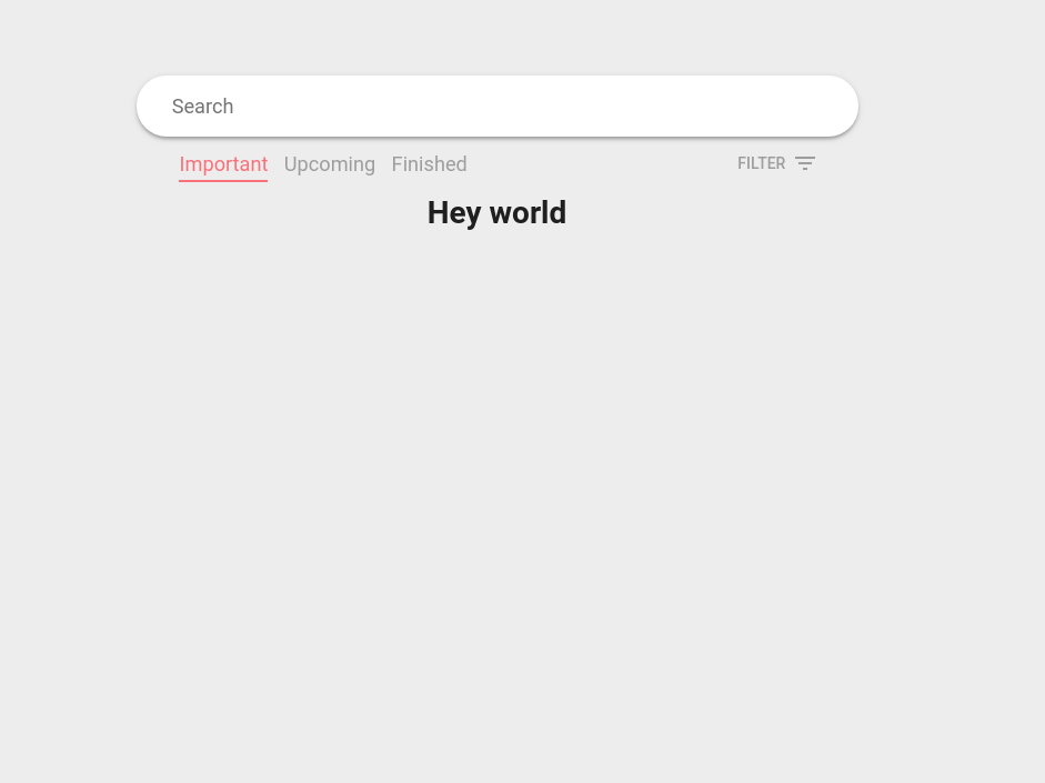
You can see that the <h1>Hi world</h1> we put in our template shows up.
We’ll code our component in this template variable. In larger projects, Vue offers something called Single File Components where you code the HTML separately and not stick it in a template variable. It makes it much easier to code. However, since I’m building this in Codepen I don’t have that luxury.
Add the following in the template string:
1
2
3
4
5
6
7
8
9
10
11
12
13
14
15
16
17
18
19
20
21
22
23
24
25
26
27
28
29
30
31
<transition-group
  tag="ul"
  class="event-card-list"
  name="fade-in"
  :css="false"
  appear>
  <li v-for="(item, index) in filteredList" :key="item.title" :data-index="index">
    <v-card class="event-card">
      <v-layout row>
        <img :src="item.pic">
        <v-layout column justify-space-between style="padding: 0.8em 1.3em; max-width: 390px;">
          <div>
            <h1 class="name"></h1>
            <h3 class="date"></h3>
          </div>
          <div>
            <p class="desc"></p>
            <div class="location">
              <v-icon v-if="item.address">location_on</v-icon>

            </div>
          </div>
          <div class="date-ribbon">
            <h2></h2>
            <h1></h1>
          </div>
        </v-layout>
      </v-layout>
    </v-card>
  </li>
</transition-group>
Whoah that’s a lot of code. What did we do? We first created a <transition-group> that emulates a ul tag. Basically it makes a list which will have transitions. The transition-group will allow the list to have the cool animations like you saw earlier. Afterwards, we create a li which contains a for loop that takes a list from filteredList. Everything afterward is just standard html. You can figure it out.
But if you refresh the page nothing shows! What gives! eventList is currently empty. Let’s go back to JS. In your component add the following:
1
2
3
4
5
6
7
8
9
10
11
12
13
14
15
16
17
18
19
20
21
22
23
24
25
26
27
28
29
30
31
32
33
34
35
36
37
38
39
40
41
42
43
44
45
46
47
48
49
50
51
52
53
54
55
56
57
58
59
60
61
62
63
64
Vue.component('event-list', {
	props: ['filterUpcoming', 'filterImportant', 'filterSearch'],
	data: () => ({

	    // Add the following
		eventList: [
			{
				title: 'Scuba Merit Badge',
				date: 'August 28 | 8am - 3pm',
				desc: 'Earn your scuba diving merit badge. Pre-req: Requirement 1a, 2b, 4ab',
				address: '503 Harbor Blvd, Destin, FL',
				pic: 'https://i.imgur.com/GmWVK3R.jpg',
				month: 'Aug',
				day: '28',
				important: true,
				upcoming: true
			},
			{
				title: 'Backpacking Hike',
				date: 'June 4th, 2018',
				desc: '10mi backpacking hike at Thunder Mountain. Remember to pack properly',
				address: 'Thunder Mtn, Disney, FL',
				pic: 'https://images.unsplash.com/photo-1467139701929-18c0d27a7516?ixlib=rb-0.3.5&ixid=eyJhcHBfaWQiOjEyMDd9&s=874439394c29dfb8f4b5a794a51a52f2&auto=format&fit=crop&w=750&q=80',
				month: 'Jun',
				day: '04',
				important: false,
				upcoming: true
			},
			{
				title: 'Black Forest Camp',
				date: 'March 3 - March 5, 2018',
				desc: 'Weekend campout in the Black Forest',
				address: 'Black Forest, Baden-Württemberg, DE',
				pic: 'https://images.unsplash.com/photo-1501703979959-797917eb21c8?ixlib=rb-0.3.5&ixid=eyJhcHBfaWQiOjEyMDd9&s=d4132e8087781addd674e137a9f596dc&auto=format&fit=crop&w=889&q=80',
				month: 'Mar',
				day: '03',
				important: false,
				upcoming: true
			},
			{
				title: 'Artic Campout',
				date: 'December 14 - 18, 2018',
				desc: 'Campout in the artic. Freeze your toes off. See cute penguins.',
				address: 'Barrow, Alaska, US',
				pic: 'https://images.unsplash.com/photo-1498279898147-67f541d32b6a?ixlib=rb-0.3.5&ixid=eyJhcHBfaWQiOjEyMDd9&s=af428042e69ac5152855548d8b4f7989&auto=format&fit=crop&w=667&q=80',
				month: 'Dec',
				day: '14',
				important: false,
				upcoming: false
			},
			{
				title: 'Sailing',
				date: 'April 23 | 11am - 7pm',
				desc: 'Sail the high seas. Get lost in the Bermuda Triangle.',
				address: 'Second star to the right, and straight on till morning',
				pic: 'https://images.unsplash.com/photo-1500514966906-fe245eea9344?ixlib=rb-0.3.5&ixid=eyJhcHBfaWQiOjEyMDd9&s=9193225514494f3e830d444d4ae58819&auto=format&fit=crop&w=667&q=80',
				month: 'Apr',
				day: '23',
				important: false,
				upcoming: false
			}
		]
		// Wow that was a lot of data
	}),
Bam. You just added a bunch of items to the list. This just gives us all the items to our eventList with their metadata. If you check your page it should now be populated with a list. And images everywhere. Let’s add some styling to fix that.
Add the following to your CSS:
1
2
3
4
5
6
7
8
9
10
11
12
13
14
15
16
17
18
19
20
21
22
23
24
25
26
27
28
29
30
31
32
33
34
35
36
37
38
39
40
41
42
43
44
45
46
47
48
49
50
51
52
53
54
55
56
57
58
59
60
61
62
63
64
65
66
67
68
69
70
71
72
73
74
75
76
77
78
79
80
81
82
83
84
85
86
87
88
89
90
91
92
93
94
95
96
97
98
99
100
101
102
103
104
105
106
.event-card-list {
	margin-top: 4em;
}

.event-card-list li {
	list-style: none;
	margin: 2em 0;
}

.event-card {
	overflow: hidden;
	width: 630px;

	border-radius: 0.3em;
}

.event-card img {
	width: 240px;
	height: 200px;

	object-fit: cover;
}

.event-card .name {
	font-size: 2.3em;
	font-weight: 400;
}

.event-card .name a {
	text-decoration: none;
	/*color: #212121;*/
}

.event-card .date {
	font-size: 1.4em;
	font-weight: 400;
	color: #6D6D6D;
}

.event-card .location {
	font-size: 1em;
	color: #757575;
}

.event-card .location i {
	font-size: 1.1em;
	padding-right: 0.3em;
	margin-bottom: 0.085em;
}

.event-card .desc {
	margin-bottom: 0.2em;
	font-size: 1.16em;
	padding-left: 0.1em;
}

.event-card .date-ribbon {
	position: absolute;
	top: 0;
	left: 2em;
	background: #FE453E;
	color: #fff;
	padding: 0.2em 1em;
	padding-bottom: 0;
	border-radius: 0;
}

.event-card .date-ribbon::before, .event-card .date-ribbon::after {
	content: '';
	position: absolute;
	top: 100%;

	width: 50%;
	height: 30px;
}

.event-card .date-ribbon::before {
	left: 0;
	border-left:solid 2em #FE453E;
	border-top: solid 15px #FE453E;
	border-bottom: solid 15px transparent;
	border-right: solid 2em transparent;
	}

.event-card .date-ribbon::after {
	right: 0;
	border-right:solid 2em #FE453E;
	border-top: solid 15px #FE453E;
	border-bottom: solid 15px transparent;
	border-left: solid 2em transparent;
}

.event-card .date-ribbon h2 {
	font-weight: 500;
	font-size: 1.15em;
	letter-spacing: 0.07em;
	text-align: center;
}

.event-card .date-ribbon h1 {
	text-align: center;
	font-weight: 400;
	font-size: 2.45em;
	margin-top: -0.09em;
	line-height: 1em;
}
You should have something like this now:
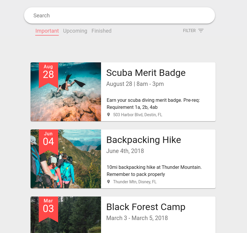
Looking great! We’re done now right? Well you can most certaintly be done with it right now if you wish. But we’re missing animations and search bar filtering.
Let’s work on search bar filtering.
Remember the props we declared earlier? We’ll use those to filter out the items. Go down to filteredList in our Vue component. Add the following:
1
2
3
4
5
6
7
8
9
10
11
12
13
14
15
16
17
18
19
20
21
22
23
24
25
26
27
Vue.component('event-list', {
  props: ['filterUpcoming', 'filterImportant', 'filterSearch'],
  data: () => ({
    eventList: [...]   // All that data from earlier
  }),
  computed: {

   //// Add this ////
   filteredList() {
      this.filterUpcoming

      return this.eventList.filter(e => {
        let conditions = [true, true, true];
        conditions[0] = e.upcoming == this.filterUpcoming;

        if(this.filterImportant)
          conditions[1] = e.important == this.filterImportant;
        if(this.filterSearch.trim() != '')
          conditions[2] = e.title.toLowerCase().includes(this.filterSearch.trim().toLowerCase());

        return conditions.every(e => e === true);
      });
    }
    //// Add above ////
  },
  template: `...Your current template`
})
See how this.fitlerUpcoming is alone below the function name? What’s up with that? That is there so Vue can create a dependency link. It’s pretty complicated and you can read up on how Vue handles it here. We use the filter function on evenList. conditions is an array of conditions that needs to be checked. Initially we set them all to true. If you look down at the bottom it uses the every function to check if every item in the list is true. If one item in conditions is set to false, the item will not show up in the list. The first condition is set to false if the item does not match the filterUpcoming value. The second condition is set to false if filterImportant is set to true and doesn’t match. The third condition is set to false if the title doesn’t match the search bar.
Now you should be able to search, and pick through the important, upcoming, and finished buttons and have the list react.
We’re almost done. The only thing left to add is the animations. Go back to your component template. Make the following edits:
1
2
3
4
5
6
7
8
9
10
11
12
13
14
<transition-group
  tag="ul"
  class="event-card-list"
  name="fade-in"
  :css="false"
  <!-- Add the following -->
  v-on:before-enter="cardBeforeEnter"
  v-on:enter="cardEnter"
  v-on:leave="cardLeave"
  <!-- End of change -->
  appear>
  <li v-for="(item, index) in filteredList" :key="item.title" :data-index="index">
    <v-card class="event-card">
      <v-layout row>
Now go back to your component JavaScript. Add the following:
1
2
3
4
5
6
7
8
9
10
11
12
13
14
15
16
17
18
19
20
21
22
23
24
25
26
27
28
29
30
31
32
33
34
35
36
37
38
39
40
Vue.component('event-list', {
  props: ['filterUpcoming', 'filterImportant', 'filterSearch'],
  data: () => ({
    eventList: [...]   // All that data from earlier
  }),
  computed: {
    filteredList() { ... } // Filtering magic
  },

  //// Add the following ////
  methods: {
    cardBeforeEnter(el) {
      el.style.opacity = 0;
      el.style.transform = 'scale(90%)';
      el.style.height = 0;
    },
    cardEnter(el, done) {
      let delay = el.dataset.index * 200;
      setTimeout(() => {
        Velocity(
          el,
          { opacity: 1, height: '100%', scale: '100%' },
          { complete: done }
        );
      }, delay);
    },
    cardLeave(el, done) {
      let delay = el.dataset.index * 200;
      setTimeout(() => {
      Velocity(
        el,
        { opacity: 0, height: 0, scale: '90%' },
        { complete: done }
      );
    }, delay);
  },
  //// End of addition ////

  template: `...Your current template`
})
The bindings from the HTML we just added will be binded to these JS functions. If you want an in-depth explanation of how these animations work, check out the vue guide.
That’s it! We’re done! Now you have a cool event-list component with filtering and animations. Check out the codepen for clarifications:
If you have any questions, hit me up on Twitter!